


Flex is designed
for results
Interactive content consistently outperforms static content. With longer dwell times, dramatically higher engagement, and conversion rates up to 2×, it delivers results you can measure and build on.
Made for the makers redefining the rules.
Flex lets you build content that feels alive. It's fast, fluid, and dynamic. It helps you transforn static layouts into living, engaging experiences.


Responsive design
Smart layouts that scale.
Flex handles the heavy lifting so you don’t have to. Set breakpoints, preview side by side, and watch updates cascade perfectly. Styles stay synced across screens, sizes, and typography.


Brand Components & Text Styles
Your styles.
on autopilot.
Set your styles once. Flex keeps headers, body, buttons, colors in sync everywhere, across all your breakpoints.

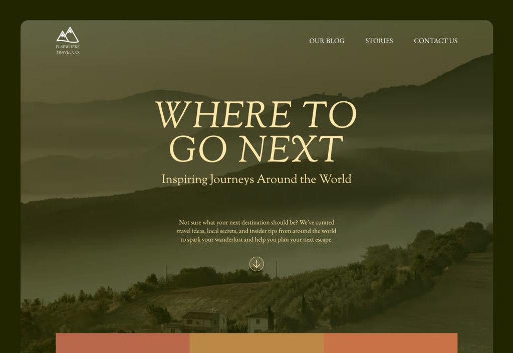
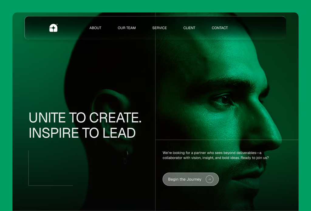
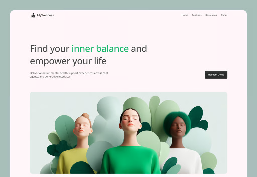
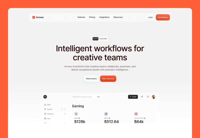
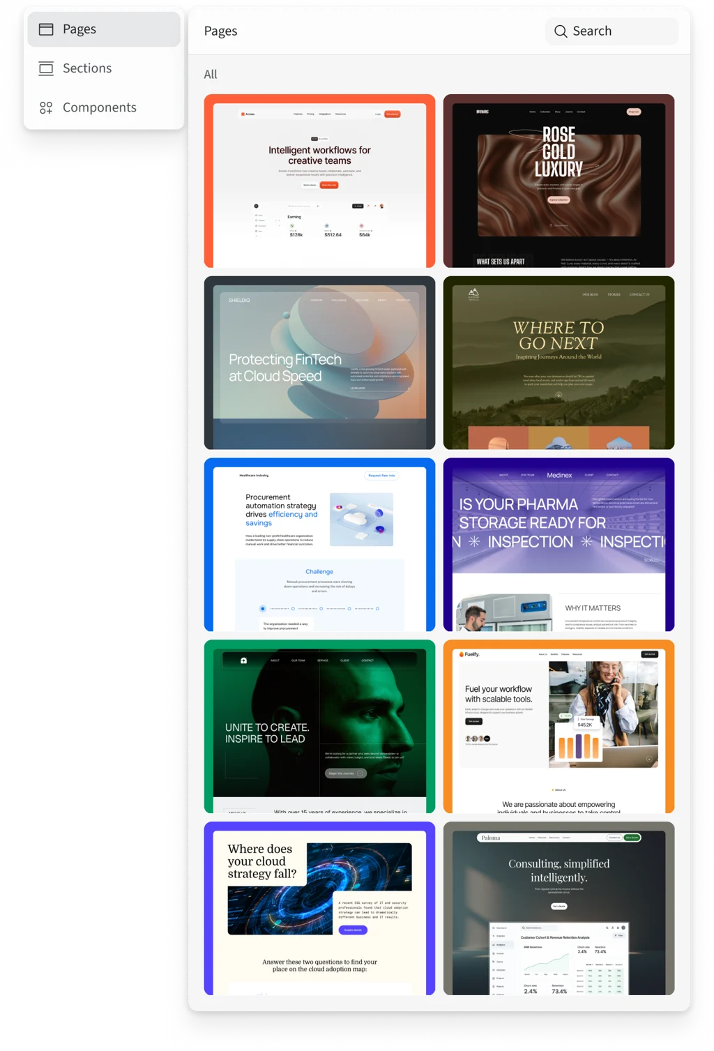
Flex examples
New Templates
Ceros Flex introduces a new generation of responsive templates that adapt seamlessly across devices. They include pre-built styles, interactive modules, and ready-made sections, making it faster and easier to create modern, engaging digital experiences.


Animation & Interaction
Scroll with soul.
Flex makes scroll-triggered animations easy to build and effortless to preview. No devs, no guesswork, just high-impact storytelling.

Animation
Motion with meaning
Flex unlocks a new level of animation. Smoother, smarter, more expressive. You’re in control. Great design doesn’t sit still. It performs.
Animation
Interaction
More ways to make things click
Tap, hover, scroll, swipe. Flex gives you total control over how people engage. Every interaction feels sharp, and intentional.
Reimagined Design System
New look.
Smarter logic.
Flex runs on three things: speed, performance, and zero friction. Built for the modern web. And the people who design it.
Templates & sections
Reuse. Refine. Repeat.
Save time and stay consistent with reusable templates, sections, and components. Build once, customize endlessly, and keep every experience on-brand across every screen.
Powerful features.
zero friction.
Built for speed & flow
Flex isn’t an update. It’s a reinvention. Redesigned, reengineered, and rebuilt from the ground up for speed, power and your best creative ideas.
Real-time collaboration
Real-time edits. One unified workspace. Everyone’s in the same space, building toward the same vision. No pings, no silos, no second-guessing.
One-click publishing
One click, and it’s out in the world. No exporting from your design apps. No dev handoff. Just publish and it’s done.
Built for SEO
Clean code. Lightning load times. Semantic structure. Flex isn’t just pretty, it’s built to rank. Your work deserves to be discovered.
WCAG 2.2 Compliance
Flex is built to meet WCAG 2.2 standards out of the box. Because great design works for everyone.
Speed that scores
Zero lag. Instant load. No spinning wheels, no stress. Flex runs fast so your ideas don’t have to wait. Lighthouse scores 95+.
Words from our early users


Made in Flex
%201.svg?imageOpt=1&width=1024)
